


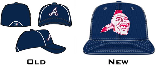
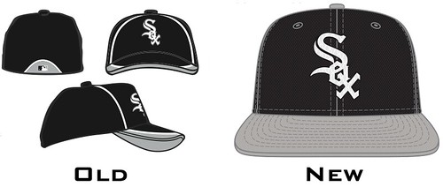
While the Braves opted to go with the most offensive logo they could think of, regressing to the “screaming savage” of old, the White Sox opted to keep it boring with their new batting practice gear, which can be viewed here. An opportunity was missed, I think, to jazz it up a bit.
They’re just practice hats, to be worn in Spring Training and as the name would indicate, during batting practice, but that’s not their true purpose. The true purpose is marketing. Dollars! A team that spent a large portion of the summer crying foul on the fans for not attending games before opting to slash ticket prices for 2013 should probably take advantage of such opportunities. A larger departure from the traditional White Sox logo utilized on everyday uniforms would certainly have boosted hat sales as a portion of fans would drop a couple bucks to support the look.
The flying sock has been bandied about as a quality idea, or even the diamond sock that was removed from the jerseys prior to the 2011 season with a significant amount of fan muttering. Some change from what is generally seen, or any of the various logos the team has enjoyed in the past. Many teams went with old logos, the Brewers and the blue glove, the A’s brought back the elephant. The Reds and the Mets have brought in their baseball headed mascots to represent the team while the Rockies and Diamondbacks are using their original logos. The majority of teams did keep things similar to the norm, with just minor color alterations, but it’s a shame to see the White Sox be in that pack.
Then again, when one team is planning on sporting the most racially insensitive logo in baseball I don’t suppose there is much room to get upset at the White Sox being conservative.